20 Plotly concepts with Before-and-After Examples
1. Creating Line Plots (plotly.graph_objects.Scatter) 📉
Boilerplate Code:
import plotly.graph_objects as go
Use Case: Create a line plot to visualize trends in data. 📉
Goal: Plot data points connected by lines to show trends. 🎯
Sample Code:
fig = go.Figure(data=go.Scatter(x=[1, 2, 3], y=[4, 5, 6], mode='lines'))
fig.show()
Before Example: You have data points but no visual representation of the trend. 🤔
Data: x = [1, 2, 3], y = [4, 5, 6]
After Example: With Scatter from graph_objects, you get a line plot! 📉
Output: A line plot connecting the points.
Challenge: 🌟 Try changing the mode to 'markers+lines' to display both the markers and the connecting lines.
2. Creating Bar Charts (plotly.graph_objects.Bar) 📊
Boilerplate Code:
import plotly.graph_objects as go
Use Case: Create a bar chart to visualize categorical data. 📊
Goal: Use bars to compare different categories. 🎯
Sample Code:
fig = go.Figure(data=go.Bar(x=['A', 'B', 'C'], y=[10, 20, 30]))
fig.show()
Before Example: You have categories with associated values but no visual comparison. 🤔
Data: x = ['A', 'B', 'C'], y = [10, 20, 30]
After Example: With Bar, you get a simple bar chart to compare categories! 📊
Output: A bar chart comparing values for A, B, and C.
Challenge: 🌟 Try stacking bars by adding another series of values with go.Bar.
3. Histograms (plotly.graph_objects.Histogram) 📈
Boilerplate Code:
import plotly.graph_objects as go
Use Case: Create a histogram to visualize the distribution of data. 📈
Goal: Display the frequency of data points within certain ranges (bins). 🎯
Sample Code:
fig = go.Figure(data=go.Histogram(x=[1, 2, 2, 3, 4, 4, 4, 5]))
fig.show()
Before Example: You have a dataset but no understanding of how frequently values occur. 🤔
Data: [1, 2, 2, 3, 4, 4, 4, 5]
After Example: With Histogram, you can visualize the frequency distribution! 📈
Output: A histogram showing frequency counts for each bin.
Challenge: 🌟 Try changing the nbinsx parameter to customize the number of bins.
4. Scatter Plots (plotly.express.scatter) 🟢
Boilerplate Code:
import plotly.express as px
Use Case: Create a scatter plot to display relationships between two numerical variables. 🟢
Goal: Plot individual data points to visualize correlations or patterns. 🎯
Sample Code:
fig = px.scatter(x=[1, 2, 3], y=[4, 5, 6])
fig.show()
Before Example: You have two sets of numerical data but no visualization of their relationship. 🤔
Data: x = [1, 2, 3], y = [4, 5, 6]
After Example: With Scatter, the relationship between x and y is clear! 🟢
Output: A scatter plot showing individual data points.
Challenge: 🌟 Try adding a color dimension by passing a color argument to px.scatter().
5. Pie Charts (plotly.express.pie) 🥧
Boilerplate Code:
import plotly.express as px
Use Case: Create a pie chart to show proportions of categories. 🥧
Goal: Use a circular chart to show the relative size of parts of a whole. 🎯
Sample Code:
fig = px.pie(values=[4500, 2500, 1050], names=['Rent', 'Food', 'Utilities'])
fig.show()
Before Example: You have categories with values but no visual representation of their proportions. 🤔
Data: ['Rent', 'Food', 'Utilities'], [4500, 2500, 1050]
After Example: With Pie, you get a clear visual of category proportions! 🥧
Output: A pie chart showing relative sizes.
Challenge: 🌟 Try exploding a slice by setting the pull argument for one of the slices.
6. Box Plots (plotly.express.box) 📦
Boilerplate Code:
import plotly.express as px
Use Case: Create a box plot to display distributions and outliers. 📦
Goal: Use quartiles and whiskers to show the spread of data and detect outliers. 🎯
Sample Code:
fig = px.box(y=[1, 2, 3, 4, 5, 6, 7, 8, 9, 10])
fig.show()
Before Example: You have numerical data but no visualization of its spread or outliers. 🤔
Data: [1, 2, 3, 4, 5, 6, 7, 8, 9, 10]
After Example: With Box, you can visualize the data's spread and detect outliers! 📦
Output: A box plot showing the distribution of data points.
Challenge: 🌟 Try adding categories by passing an x argument to split the box plots by groups.
7. Heatmaps (plotly.graph_objects.Heatmap) 🔥
Boilerplate Code:
import plotly.graph_objects as go
Use Case: Create a heatmap to visualize data intensity across a matrix. 🔥
Goal: Display the intensity of values across two dimensions using colors. 🎯
Sample Code:
fig = go.Figure(data=go.Heatmap(z=[[1, 20, 30], [20, 1, 60], [30, 60, 1]]))
fig.show()
Before Example: You have a matrix of values but no clear way to see how their intensities compare. 🤔
Data: z = [[1, 20, 30], [20, 1, 60], [30, 60, 1]]
After Example: With Heatmap, you can visualize the intensity of values across the matrix! 🔥
Output: A heatmap showing intensity with color.
Challenge: 🌟 Try customizing the colorscale to better highlight intensity differences.
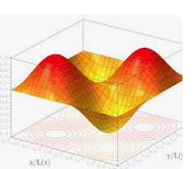
8. 3D Surface Plots (plotly.graph_objects.Surface) 🗻
Boilerplate Code:
import plotly.graph_objects as go
Use Case: Create a 3D surface plot to visualize 3D data. 🗻
Goal: Use a 3D surface to represent data points across three dimensions. 🎯
Sample Code:
fig = go.Figure(data=[go.Surface(z=[[1, 2, 3], [2, 3, 4], [3, 4, 5]])])
fig.show()
Before Example: You have 3D data but no visual representation of its shape or form. 🤔
Data: z = [[1, 2, 3], [2, 3, 4], [3, 4, 5]]
After Example: With Surface, you get a clear 3D visualization of the data! 🗻
Output: A 3D surface plot showing height variations.
Challenge: 🌟 Try rotating the plot or adding more detailed data points to see how the surface changes.
9. Bubble Charts (plotly.express.scatter) 🔵
Boilerplate Code:
import plotly.express as px
Use Case: Create a bubble chart to display relationships between three
variables. 🔵
Goal: Use the size of bubbles to add a third dimension to scatter plots. 🎯
Sample Code:
fig = px.scatter(x=[1, 2, 3], y=[4, 5, 6], size=[10, 20, 30])
fig.show()
Before Example: You have three variables but no way to visualize them in one plot. 🤔
Data: x = [1, 2, 3], y = [4, 5, 6], size = [10, 20, 30]
After Example: With Bubble, you visualize the relationships using bubble size! 🔵
Output: A scatter plot with bubbles of varying sizes.
Challenge: 🌟 Try adding a fourth dimension using the color argument.
10. Density Contour Plots (plotly.express.density_contour) 🌐
Boilerplate Code:
import plotly.express as px
Use Case: Create a density contour plot to visualize the density of data points. 🌐
Goal: Use contours to highlight areas of high and low data density. 🎯
Sample Code:
fig = px.density_contour(x=[1, 2, 2, 3, 4, 4, 5], y=[10, 10, 11, 12, 12, 13, 14])
fig.show()
Before Example: You have data points but no visualization of their density distribution. 🤔
Data: x = [1, 2, 2, 3, 4, 4, 5], y = [10, 10, 11, 12, 12, 13, 14]
After Example: With density contour, you can visualize where points cluster! 🌐
Output: A density contour plot showing regions of high density.
Challenge: 🌟 Try adding more data points and increasing the number of contour levels.
Awesome! Let's continue with 11-20 key Plotly concepts.
11. Gantt Charts (plotly.express.timeline) 🕒
Boilerplate Code:
import plotly.express as px
Use Case: Create a Gantt chart to visualize a timeline of tasks or events. 🕒
Goal: Show the start and end times of tasks or events along a timeline. 🎯
Sample Code:
import pandas as pd

# Example data
df = pd.DataFrame({
    'Task': ['Task A', 'Task B', 'Task C'],
    'Start': ['2023-01-01', '2023-02-01', '2023-03-01'],
    'Finish': ['2023-01-31', '2023-02-28', '2023-03-31']
})

# Create Gantt chart
fig = px.timeline(df, x_start="Start", x_end="Finish", y="Task")
fig.show()
Before Example: You have a list of tasks with start and end dates but no visual timeline. 🤔
Data: Task A: Jan 1 - Jan 31, Task B: Feb 1 - Feb 28, etc.
After Example: With timeline, the tasks are visually represented on a Gantt chart! 🕒
Output: A Gantt chart showing task durations.
Challenge: 🌟 Try adding task categories or coloring tasks by their priority level.
12. Subplots (plotly.subplots.make_subplots) 🖼️
Boilerplate Code:
from plotly.subplots import make_subplots
Use Case: Create subplots to display multiple plots in one figure. 🖼️
Goal: Combine multiple plots (e.g., line, bar, scatter) into a single figure. 🎯
Sample Code:
# Create subplot grid (1 row, 2 columns)
fig = make_subplots(rows=1, cols=2)

# Add line plot to the first subplot
fig.add_trace(go.Scatter(x=[1, 2, 3], y=[4, 5, 6], mode='lines'), row=1, col=1)

# Add bar chart to the second subplot
fig.add_trace(go.Bar(x=['A', 'B', 'C'], y=[10, 20, 30]), row=1, col=2)

fig.show()
Before Example: You have multiple plots but no way to view them side by side. 🤔
Plots: Line plot and bar chart.
After Example: With subplots, both plots are displayed in a single figure! 🖼️
Output: A figure with two subplots.
Challenge: 🌟 Try creating a 2x2 grid with different types of charts in each subplot.
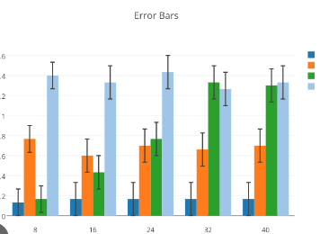
13. Error Bars (plotly.graph_objects.Scatter) 📏
Boilerplate Code:
import plotly.graph_objects as go
Use Case: Add error bars to plots to show the uncertainty in data points. 📏
Goal: Represent uncertainty or variability in the data. 🎯
Sample Code:
# Create scatter plot with error bars
fig = go.Figure(data=go.Scatter(
    x=[1, 2, 3],
    y=[4, 5, 6],
    error_y=dict(type='data', array=[0.5, 0.2, 0.4])
))
fig.show()
Before Example: You have data but no way to indicate how uncertain or variable each point is. 🤔
Data: x = [1, 2, 3], y = [4, 5, 6]
After Example: With error bars, you can visually show the variability or uncertainty! 📏
Output: A scatter plot with vertical error bars.
Challenge: 🌟 Try adding horizontal error bars by using the error_x argument.
14. Animations (plotly.express.scatter) 🎞️
Boilerplate Code:
import plotly.express as px
Use Case: Create animated plots to show changes in data over time. 🎞️
Goal: Visualize how data evolves with time or across categories. 🎯
Sample Code:
df = px.data.gapminder()

# Create animated scatter plot
fig = px.scatter(df, x="gdpPercap", y="lifeExp", animation_frame="year", animation_group="country",
                 size="pop", color="continent", hover_name="country", log_x=True, size_max=60)
fig.show()
Before Example: You have time-series data but no way to show how it changes dynamically. 🤔
Data: Country data over time.
After Example: With animations, you get a dynamic visualization showing how the data evolves! 🎞️
Output: An animated scatter plot showing the change over time.
Challenge: 🌟 Try creating animations for different datasets, such as stock prices or weather data.
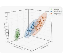
15. 3D Scatter Plots (plotly.graph_objects.Scatter3d) 🛰️
Boilerplate Code:
import plotly.graph_objects as go
Use Case: Create a 3D scatter plot to visualize relationships in three dimensions. 🛰️
Goal: Visualize data with three continuous variables in a 3D space. 🎯
Sample Code:
fig = go.Figure(data=[go.Scatter3d(x=[1, 2, 3], y=[4, 5, 6], z=[7, 8, 9], mode='markers')])
fig.show()
Before Example: You have three variables but no clear way to visualize them in 3D. 🤔
Data: x = [1, 2, 3], y = [4, 5, 6], z = [7, 8, 9]
After Example: With 3D scatter, the data points are plotted in a 3D space! 🛰️
Output: A 3D scatter plot with markers.
Challenge: 🌟 Try rotating the 3D plot and adding colors to the points to enhance the visualization.
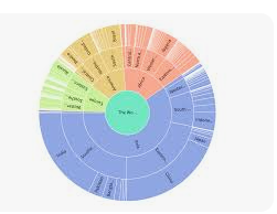
16. Sunburst Charts (plotly.express.sunburst) 🌞
Boilerplate Code:
import plotly.express as px
Use Case: Create a sunburst chart to visualize hierarchical data. 🌞
Goal: Use concentric rings to represent levels of hierarchy in the data. 🎯
Sample Code:
df = px.data.tips()

# Create sunburst chart
fig = px.sunburst(df, path=['day', 'time', 'sex'], values='total_bill')
fig.show()
Before Example: You have hierarchical data but no way to visualize the nested relationships. 🤔
Data: Day, time, and gender with associated total bill values.
After Example: With sunburst, you can visualize the hierarchy with concentric rings! 🌞
Output: A sunburst chart showing the hierarchy of categories.
Challenge: 🌟 Try adding hover data or drilling down into specific parts of the chart.
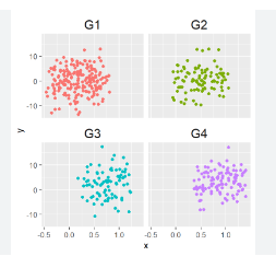
17. Facet Plots (plotly.express.scatter) 🧩
Boilerplate Code:
import plotly.express as px
Use Case: Create facet plots to display subsets of data side by side in multiple panels. 🧩
Goal: Visualize how subsets of data differ from each other by splitting into panels. 🎯
Sample Code:
df = px.data.tips()

# Create scatter plot with facets
fig = px.scatter(df, x="total_bill", y="tip", facet_col="sex", facet_row="time")
fig.show()
Before Example: You have multiple categories but no way to compare them side by side. 🤔
Data: Total bill vs tip by time and gender.
After Example: With facet plots, you can compare different subsets of the data in separate panels! 🧩
Output: A grid of scatter plots for different subsets of the data.
Challenge: 🌟 Try facetting by multiple categorical variables and adjusting the plot size.
18. Contour Plots (plotly.graph_objects.Contour) 🌀
Boilerplate Code:
import plotly.graph_objects as go
Use Case: Create a contour plot to show the relationship between three variables using contour lines. 🌀
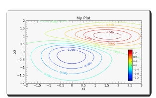
Goal: Visualize the density or intensity of data using contour lines. 🎯
Sample Code:
fig = go.Figure(data=go.Contour(z=[[10, 10.625, 12.5], [13.75, 15.625, 17.5], [20, 22.5, 25]]))
fig.show()
Before Example: You have 3D data but no way to represent the intensity using 2D contours. 🤔
Data: z-values for contour lines.
After Example: With contour plots, you visualize the intensity of data using smooth contour lines! 🌀
Output: A 2D contour plot showing data intensity.
Challenge: 🌟 Try creating filled contour plots by setting the contours_coloring parameter to 'heatmap'.
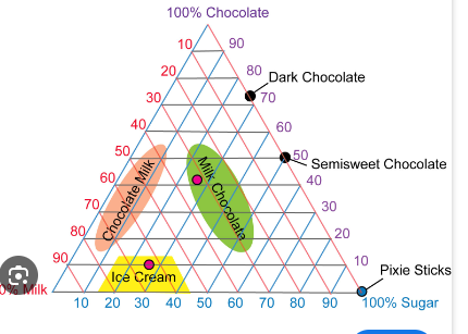
19. Ternary Plots (plotly.express.scatter_ternary) 🔺
Boilerplate Code:
import plotly.express as px
Use Case: Create a ternary plot to display the relationship between three variables that sum to a constant. 🔺
Goal: Visualize how three proportions interact and change in a triangular plot. 🎯
Sample Code:
df = px.data.election()

# Create ternary plot
fig = px.scatter_ternary(df, a="Joly", b="Coderre", c="Bergeron", size="total", hover_name="district")
fig.show()
Before Example: You have three variables that sum to a constant but no clear way to visualize them. 🤔
Data: Support for three candidates.
After Example: With ternary plots, you visualize the proportions in a triangle! 🔺
Output: A ternary plot showing the proportions of three variables.
Challenge: 🌟 Try adding labels to the vertices of the triangle to make the plot more informative.
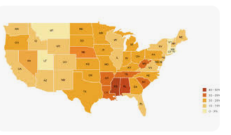
20. Choropleth Maps (plotly.express.choropleth) 🗺️
Boilerplate Code:
import plotly.express as px
Use Case: Create a choropleth map to visualize data by geographic regions. 🗺️
Goal: Display data values on a map using colors to indicate different ranges. 🎯
Sample Code:
df = px.data.gapminder()

# Create choropleth map
fig = px.choropleth(df, locations="iso_alpha", color="lifeExp", hover_name="country",
                    animation_frame="year", projection="natural earth")
fig.show()
Before Example: You have geographical data but no way to visualize it on a map. 🤔
Data: Life expectancy by country.
After Example: With choropleth maps, the data is displayed geographically! 🗺️
Output: A map showing life expectancy with color shading.
``

`

**Challenge**: 🌟 Try using choropleth maps to visualize other data like population density or GDP per capita.

---

That wraps up **20 key Plotly concepts**! Let me know if you'd like to explore another library or dive deeper into these topics. 😊