Exploring Financial Data with Nasdaq Data Link
Exploring Financial Data using Nasdaq Data Link API
1. Importing Libraries and Configuration
We start by importing the libraries and the config.py file where your API key is stored.
# Importing necessary libraries together with the config.py file
import requests
import json
import pandas as pd
import config

# Configuring the API key
api_key = config.api_key
Explanation:
requests: Used for making HTTP requests (to fetch data from the API).json: Helps handle JSON data (returned by the API).pandas: For data manipulation and creating DataFrames.config: A custom file that stores your API key securely.
2. Setting the API URL and Parameters
We set the base URL for the API and define parameters for the request.
# Base URL for Nasdaq Data Link API
api_url = 'https://data.nasdaq.com/api/v3/datatables/MER/F1.json'

# Parameters for the API request
parameters = {
    'api_key': api_key,       # API key for authentication
    'qopts.per_page': 10      # Number of rows to fetch
}
Explanation:
api_url: The endpoint where we’ll fetch the financial data.parameters: Includes yourapi_keyand limits the data fetched to 10 rows (qopts.per_page).
3. Fetching Data and Converting to JSON
We make a request to the API and convert the response into JSON format.
# Fetching the data and converting it to JSON
json_data = requests.get(api_url, params=parameters).json()

# Printing the JSON data
print(json_data)
Output (Simplified):
{
  "datatable": {
    "data": [
      [2438, 1868192544, -1802, 10.481948, "2011-06-30", "Q2", ...],
      [17630, 1851369024, -4524, 161000000.0, "2010-12-31", "Q4", ...],
      ...
    ],
    "columns": [
      {"name": "compnumber", "type": "Integer"},
      {"name": "reportid", "type": "Integer"},
      {"name": "amount", "type": "BigDecimal(36,14)"},
      {"name": "reportdate", "type": "Date"},
      ...
    ]
  },
  "meta": {
    "next_cursor_id": "djFfMTAyNTkwN18xNzMwODMwMTkw"
  }
}
Interpretation:
The
datatablecontains the financial data:data: Rows of financial data as lists.columns: Column names and data types.
The
metasection provides additional info likenext_cursor_idfor fetching more data.
4. Processing the JSON Data into a DataFrame
Now, let's extract the data and columns from the JSON and create a pandas DataFrame.
# Extracting data and column names
data = json_data['datatable']['data']
columns = [col['name'] for col in json_data['datatable']['columns']]

# Creating a DataFrame
df_metric = pd.DataFrame(data, columns=columns)

# Displaying the first 5 rows
print(df_metric.head())
Explanation:
json_data['datatable']['data']: Contains the rows of financial data.json_data['datatable']['columns']: Provides column metadata, so we extract column names with a list comprehension.pd.DataFrame(data, columns=columns): Converts the list of data into a pandas DataFrame with proper column headers.
Sample Output:
   compnumber    reportid  mapcode      amount  reportdate reporttype ...
0        2438  1868192544    -1802   10.481948  2011-06-30        Q2  ...
1        2438  1868216112    -1802    8.161754  2011-09-30        Q3  ...
2        2438  1885063456    -1802   10.788213  2012-06-30        Q2  ...
3        2438  1885087024    -1802    9.437545  2012-09-30        Q3  ...
4        2438  1901934112    -1802    8.755041  2013-06-30        Q2  ...
5. Understanding the Dataset
We focus only on key columns to simplify our analysis. These include metrics like reportid, amount, and indicator.
# Selecting key columns for analysis
necessary_columns = ['reportid', 'reportdate', 'reporttype', 'amount', 'longname', 'country', 'region', 'indicator', 'statement']

# Filtering the DataFrame
df_metric = df_metric[necessary_columns]

# Displaying filtered DataFrame
print(df_metric.head())
Sample Output:
     reportid  reportdate reporttype     amount         longname country  ...
0  1868192544  2011-06-30        Q2   10.481948  Deutsche Bank AG     DEU  ...
1  1868216112  2011-09-30        Q3    8.161754  Deutsche Bank AG     DEU  ...
2  1885063456  2012-06-30        Q2   10.788213  Deutsche Bank AG     DEU  ...
3  1885087024  2012-09-30        Q3    9.437545  Deutsche Bank AG     DEU  ...
4  1901934112  2013-06-30        Q2    8.755041  Deutsche Bank AG     DEU  ...
6. Filtering for a Specific Metric
We now filter the dataset for a specific indicator, Accrued Expenses Turnover.
# Filtering for specific indicator
filtered_df = df_metric[df_metric['indicator'] == 'Accrued Expenses Turnover']

# Describing the filtered data
print(filtered_df['indicator'].describe())
Output:
count                            10
unique                            1
top       Accrued Expenses Turnover
freq                             10
Name: indicator, dtype: object
7. Enhancing the Dataset
Let’s make the country codes more readable by replacing them with full country names. For example, DEU becomes Germany. We'll use a helper function to achieve this.
Code:
# Function to update country names
def update_country_name(name):
    if name == 'USA':
        return 'United States of America'
    elif name == 'JPN':
        return 'Japan'
    elif name == 'CYM':
        return 'Cayman Islands'
    elif name == 'BHS':
        return 'Bahamas'
    elif name == 'DEU':
        return 'Germany'
    else:
        return 'Unknown'

# Applying the function
filtered_df = filtered_df.copy()
filtered_df['country_name'] = filtered_df['country'].apply(update_country_name)

# Renaming columns for clarity
filtered_df.columns = ['report_id', 'report_date', 'report_type', 'amount',
                       'company_name', 'country', 'region', 'indicator', 'statement', 'country_name']

# Display updated DataFrame
print(filtered_df[['country', 'country_name']].drop_duplicates())
Explanation:
apply(update_country_name): Applies the custom function to each row in thecountrycolumn.Renaming Columns: Makes column names more descriptive.
Sample Output:
United State of America    31
Ireland                    29
Japan                      27
Cayman Islands             27
Bahamas                    19
Germany                     6
Name: country_name, dtype: int64
8. Geographical Analysis
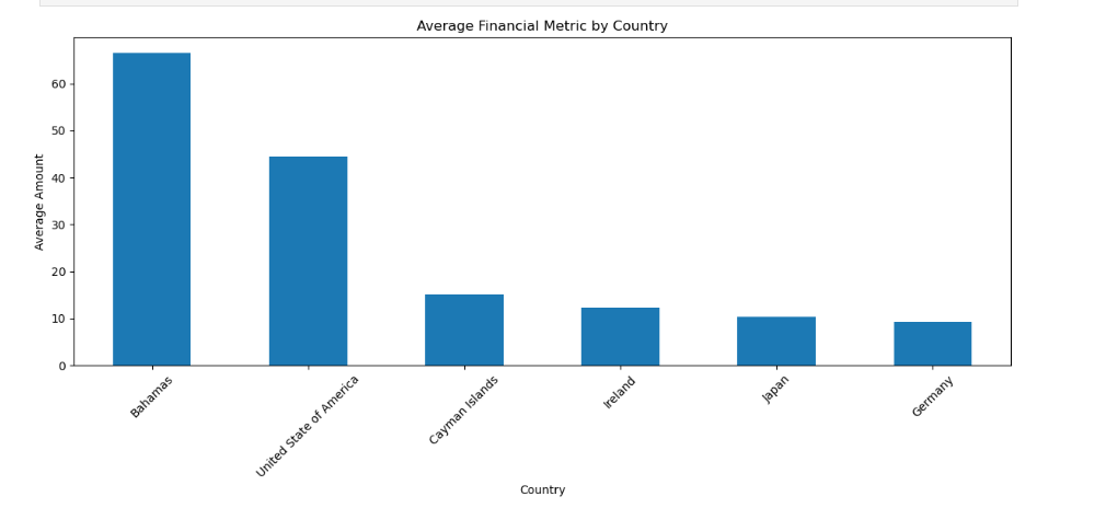
Let’s calculate the average financial metric (amount) for each country and plot the results to see which regions are leading in accrued expenses turnover.
Code:
import matplotlib.pyplot as plt

# Grouping by country and calculating the average
country_avg = filtered_df.groupby('country_name')['amount'].mean()

# Plotting the results
plt.figure(figsize=(10, 6))
country_avg.sort_values(ascending=False).plot(kind='bar', color='skyblue')
plt.title('Average Financial Metric by Country', fontsize=14)
plt.xlabel('Country', fontsize=12)
plt.ylabel('Average Amount', fontsize=12)
plt.xticks(rotation=45, fontsize=10)
plt.tight_layout()
plt.show()
Explanation:
groupby('country_name').mean(): Groups the data by country and calculates the averageamountfor each.Bar Plot: Visualizes the results for better understanding.
Sample Output: